B.A. English Literature – University of Central Arkansas – Schedler Honors College
Capstone/Thesis

B.A. English Literature – University of Central Arkansas – Schedler Honors College

M.A. Professional & Technical Writing – University of Arkansas at Little Rock

B.A. English Literature – University of Central Arkansas
Created using Adobe InDesign.

M.A. Professional & Technical Writing – University of Arkansas at Little Rock


During my first year of college, I realized something was wrong with me. But it was something that I had always lived with. I suppose I finally decided that the little beast I carried around since childhood had grown large enough that others could notice. And when other people noticed there was something “off” about me, I got nervous. I used my two recent breakups as an excuse for my gloomy behavior, but on the inside, I knew the truth. So I went to the doctor. It was a routine check-up. I was freshly 18 and didn’t need my mother to go to the back room with me, but I asked her anyway.
I’m sure my mother already knew about my anxiety. My father struggles with it, too, but we’re not the kind of family to openly talk about our struggles. Perhaps that’s part of my problem. But I couldn’t muster the courage to form the words. “Mom. Dad. I want to get on anxiety medicine. I’m feeling lonely, purposeless, and suicidal.” More than anything, I was terrified of the conversation. Of justifying the very real feelings that were consuming me. So when my then-pediatrician handed me the routine “mental health checklist,” I answered honestly (note: I usually lied). And the results were troubling.
Generalized Anxiety Disorder (GAD) is defined as “excessive, exaggerated anxiety and worry about everyday life events for no obvious reason. People with symptoms of generalized anxiety disorder tend to always expect disaster and can’t stop worrying about health, money, family, work, or school” (WebMD). My doctor suspected I was one of the thousands of teenaged victims of the disorder, which was further confirmed by subsequent tests telling me that I ranked among the “severe” cases. Rather than suffering from one particular kind of anxiety, such as social or health anxiety, I ranked noticeably in every category. I always noticed my social anxiety, but never realized how much trouble anxiety caused me in all realms of life. After some tears and an honest conversation or two, I began taking Lexapro.
The next semester was the best of my undergraduate career. My classes weren’t exceptionally difficult, I wasn’t working, and I prioritized friendships. I had never prioritized my friendships before. But then things got bad again. Really bad. Two more heartbreaks under my belt, Covid-19 cutting me off from my friends, and deciding I didn’t “need” my Lexapro, I suffered from life-threatening anxiety. I couldn’t focus in class, every day was defined by tears, I called my boyfriend constantly for reassurance, and I never had more than an hour of peace.
Sounds pretty dire, right? But it’s not all doom and gloom! It’s been about a year since I began therapy for my anxiety and started taking my medicine again. I’ve learned hundreds of new techniques for self-care, living with gratitude, and managing my anxiety. Not every technique has worked for me, but many have. So I’ve decided to compile a GAD Help Guide for all the lucky folks out there with the disorder. I can’t list every technique (or I’d put my therapist out of business), but I will include all of my favorite techniques as well as popular techniques that I have tried even if they weren’t the most effective for my lifestyle.
Medication
Taking medication for your mental health disorder is a valid treatment option. Unfortunately, I was terrified of medication due to various misinformation. When I was religious, medication was viewed as a cop-out for not being “faithful” enough in God. Some peers thoughts that medication was a slippery slope into lifelong dependence and substance-abuse issues. And I had personal fears as well, such as suffering from minor side effects. All of this misinformation led me to stop taking my medication, which completely ruined two years of progress I made dealing with my anxiety. It was only when I read a personal narrative about a woman who realized she needed her medication to function normally and wasn’t ashamed of it, I knew I had to return to Lexapro.
This section is not an endorsement of drugs and I am not an expert. Just know that it’s not shameful to seek treatment for a chemical imbalance.
Therapy
Cognitive-Behavioral Therapy (CBT) helps patients “learn to recognize and change thought patterns and behaviors that lead to anxious feelings.” This kind of therapy can be achieved by joining a support group, seeking out educational materials, or seeking a traditional therapist. I was lucky enough to find a local therapist to help me tackle my anxiety. I thought I would spend each session lying down on a couch and crying about my feelings. While I did cry a lot, CBT took a lot more dedication than spewing all of my thoughts once a week.
My therapist gave me weekly homework. In session, we discussed all of my anxious thoughts I and theorized about how I could combat them. I learned to take time to pursue my hobbies even when I was stressed about class, work, and relationships. CBT not only gave me the confidence to believe in myself and own my feelings, it was a safe space to practice practical exercises to manage my disorder.
Worry Time
Worry entails thinking about negative things that will happen in the future. Everybody worries, but when it becomes excessive enough to distract you from daily life, then it’s a problem. Worry Time is the practice of scheduling your worry to a certain time each day. Throughout the day, worriers are encouraged to stop their worried thoughts in their tracks. Instead of worrying about things in the moment, they should write down their worried thought and say to themselves “I will think about this at Worry Time.” For instance, I tried to limit my worrying to 2 p.m. for 5 minutes. During my Worry Time, I would pull out my notebook and let myself worry incessantly for the allotted time. However, I found that I really didn’t feel like worrying when 2 p.m. came around. Most of the items on my list either weren’t a problem to me anymore or I was forced to worry about “unsolvable” problems. So what happens when we have anxiety that can’t be addressed with problem-solving at Worry Time?
Mindfulness
Mindful.org defines mindfulness as “the basic human ability to be fully present, aware of where we are and what we’re doing, and not overly reactive or overwhelmed by what’s going on around us.” Because technology entices us into constant busy-ness, humans are increasingly less mindful of the present moment. Therefore, the purpose of directing your attention to the present moment and “directly experiencing via your senses” is to restructure your brain — literally! The brain is a muscle, and the more we practice living in the present moment, the more we will LIVE in the present moment without overwhelming worry. At least, it should be easier to manage worry.
One of the most popular methods to practice mindfulness is meditation. The New York Times published a piece by author David Gelles, a reporter and author of “Mindful Work: How Meditation Is Changing Business From the Inside Out.” He has over 20 years of experience researching and practicing mindfulness meditation; thus, I believe is a great source for learning how to get started.
Here are the basics:
Gratitude
Gratitude means being thankful, returning kindness, and showing appreciation for other people, things, and life events. Gratitude is one of the most powerful tools any anxious person can have in their toolbelt. It sounds simple, and that’s the beauty of it. Gratitude IS simple! Harvard Health sings the praises of gratitude, writing, “In positive psychology research, gratitude is strongly and consistently associated with greater happiness. Gratitude helps people feel more positive emotions, relish good experiences, improve their health, deal with adversity, and build strong relationships.” Overall, practicing gratitude helps people realize that happiness doesn’t only exist outside themselves, it can exist because of themselves, too.
Here are a few ways to practice gratitude:
Breathing
Breathing techniques are helpful for practicing mindfulness meditation. Even better, they’re super helpful in everyday life, too! Like guided meditations, countless experts and YouTube mental health gurus have produced their own guided breathing practices. By getting your breathing under control, you can slow your heart rate and possibly prevent a dire anxiety attack. Breathing can help you calm down in the heat of an argument, in the face of a terrifying presentation, or before an important interview. Here’s one of my favorite breathing techniques:
Pendulation
Pendulation is by far my favorite quick-and-easy technique for battling anxiety in the moment. While mindfulness and are effective for long-term purposes, pendulation has saved me from many potential anxiety attacks and impulsive displays of emotion. The purpose of this technique is to calm down your anxiety by using physical responsdes. By locating the parts of your body that are physically anxious and the parts that are physically calm, your brain can better understand that you are not actually in danger and will calm down the entire body.
The Pendulation Technique was developed by Peter Levine from his research concerning Somatic Experiencing (SE). Here is an excerpt describing the practice:
“SE is a therapeutic approach that is informed by our biology and our inborn ability to heal from trauma. I originally learned this technique from Pam Stockton, who specializes in SE. Like the hand-over-the heart technique, this technique is about noticing a feeling in your body and noticing how that feeling changes.
Here are the steps:
I typically practice pendulation like so:
Concluding Thoughts
While this help guide might be helpful for many people, I fully recognize that I will be the primary user. I wanted to compile all of the techniques that have helped me battle anxiety into one place as a reference point for whenever I just can’t think straight!

In fulfillment of WRTG 4309 Introduction to Publishing, here is a timeline of the drafts I created while developing both Project 1: Skills Development Proposal & Publishing Plan, Project 2: Publishing Plan Review Slideshow, and Project 3: Published Deliverable. These projects were assigned to test my knowledge of the publishing process and skills associated with design software including Adobe InDesign.
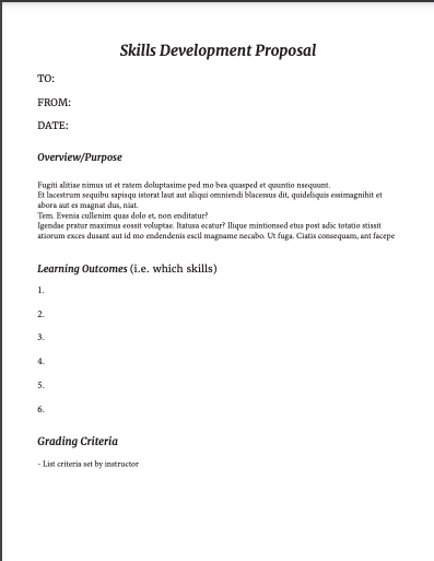
The first project for WRTG 4309 tasked students with developing a proposal for my own skills development this semester as well as a publishing plan for the Project 3 deliverable. The project is split up into two parts — the proposal and the publishing plan – but are combined into one document. The skills development proposal is specifically concerned with my personal agenda for developing practical skills with any given design software, my choice being Adobe InDesign. The publishing plan asked students to think ahead to the end of semester in regard to the document we wanted to theoretically publish with physical materials.
In my first draft, I focused on three main aspects: font, organization, and layout. I was satisfied with the colors I chose because I wanted the document to appear like a professional document, and I also enjoyed my font choice. However, I was worried that the organization of the piece was confusing or was missing necessary sections. At this point, I was unsure how to incorporate visual imagery.
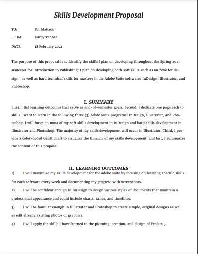
As you can see, my second draft includes a much more detailed mock-up of what I wanted the Skills Development Proposal and the Publishing Plan to look like. I also filled in much of the content and explanation. However, my timeline was not accurate to the weeks I would be working on Project 3 and I still had fears that my project was too cramped.
The final draft of Project 1 led to huge changes and additions, including adjusting the layout to fit IEEE Guidelines and add in all of the detailed information regarding the specific skills I wanted to develop as well as the publishing specifications. I wasn’t completely satisfied with the colors I chose or the layout of the “Estimated Costs” table, but I was happy with my work overall.

Project 2 is basically an extension of Project 1 but was heavily focused on peer review and collaboration specifically regarding the Publishing Plans. I won’t go into detail regarding what my team discussed because we summarize our feedback in a PowerPoint presentation, which is included as a file to view at the end of this section. The point of this project was to engage in usability and design critiques with a dedicated group of peers so that there was an opportunity for routine and substantive feedback.
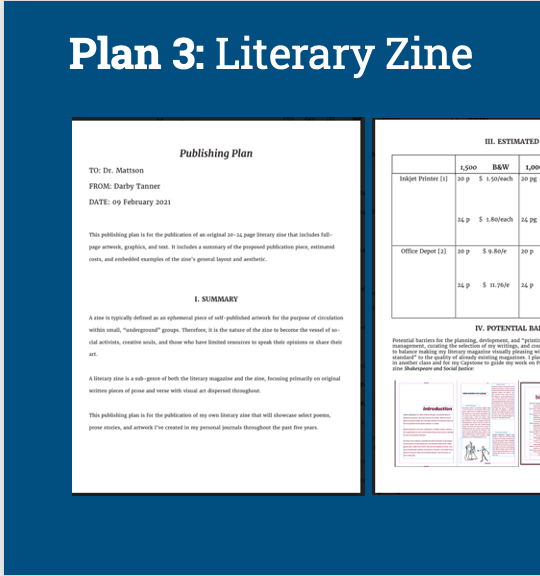
Project 3 is the culmination of the work put into Projects 1 and 2 regarding the Publishing Plan. Each student was tasked with applying our publishing, design, and personal knowledge to developing a published deliverable. Each deliverable had to be on a subject of value to a subject matter expert (SME) and must comprise 20 OR 24 pages of content (including front and back cover) in order to This number of pages will give us opportunity to practice 4 principles of design and the skills we taught ourselves in our chosen software throughout the semester. I used Adobe InDesign to develop a literary magazine comprised of my original art and poetry, which I put through extensive edits to be included in this piece.
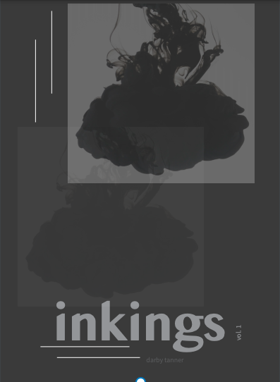
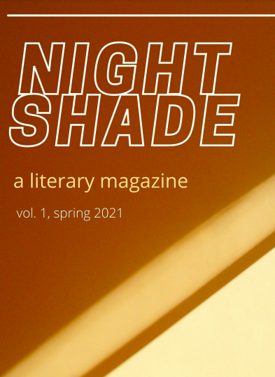
Draft 1 is the only draft that was peer reviewed for this project cycle. As you can see when you see my final draft, I was very conflicted about the color palette of my project. I originally wanted the magazine to be titled “inkings” after my first Wattpad poetry collection called “ink,” but I feared that my cover design — while fitting the genre conventions — was too dark and bland. My peer reviewers primarily agreed, so I completely switched up my title and color palette to warm neutrals and renamed it “Nightshade” after one of the poems included in the collection.
If I were to actually print this collection, I would spend more time adding in photos of my original art, experimenting with font, and adjusting the font sizes. At this moment, I prefer the color palette of my final draft but I think the “inkings” cover design was more engaging and genre-appropriate than my Canva-made “Nightshade” cover. I will probably try to combine my ideas for each draft into a final deliverable if I ever want to physically circulate “Nightshade.”

In fulfillment of WRTG 3306 Information Design II, here is a timeline of the drafts I created while developing both Project 1: Usability/Accessibility Help Guides and Project 2: Usability/Accessibility Testing Your Design. These projects were assigned to test my knowledge of the user experience (UX) and my design skills in terms of usability and accessibility.
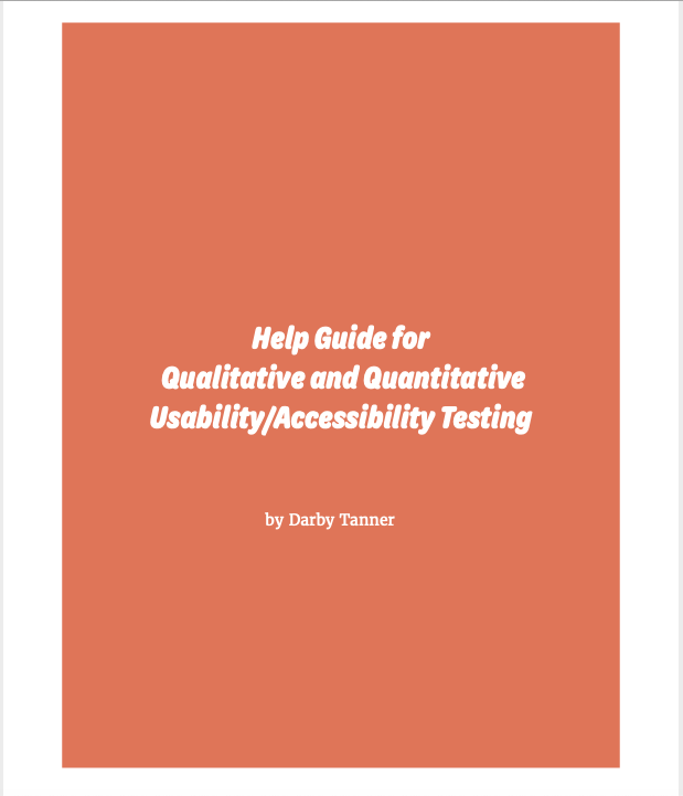
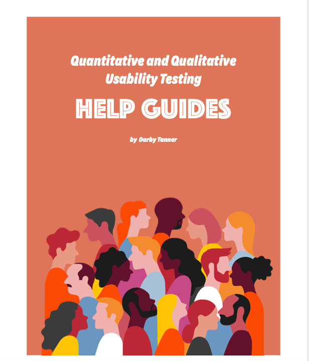
The first project for WRTG 3306 tasked students with developing “Help Guides” for potential clients who need help developing their own guidelines and “best practices” for UX testing. The project is split up into two parts — a quantitative testing help guide and a qualitative testing help guide– that consist of two peer-reviewed drafts and one final draft.
In my first draft, I focused on three main aspects: font, color palette, and layout. I was satisfied with the colors I chose, but I had concerns regarding my font choice. I worried that the “bubble” letters used on the title page and subsequent headings weren’t readable. However, I was confident that my organizational layout was logical and easy to follow. My peer review session helped me choose how to design my title page so that the fonts flowed together without blending.
I made significant progress regarding content and visuals by the time I submitted Draft 2 for peer review. I struggled putting myself in the shoes of a UX expert who was making this document for a client, so I only had half the questions for each section filled out. Discussion with peers helped me to better understand what questions I should be including in each section. I also decided that the vector graphics I included were suitable for the project, but I knew the blue graphic on the “Contents” page did not fit the color scheme.
In addition to filling out the rest of the content, my Final Draft endured extensive layout changes. With the advice of my peers in tow and guidance from their own designs, I decided that my previous layout was too cramped; therefore, I separated each section by pages rather than relying on headings to do all the work for me. This allowed for the project to have a more professional and readable aesthetic. Lastly, I changed the font for the content pages. This change was a result of a flaw in my design that I labeled as “imbalance.” Where I first thought a serif font would balance out the bubble font, I quickly realized that the fonts did not blend well together. So I chose a crisp, thin sans serif font and used the “bold” feature to highlight key terms.
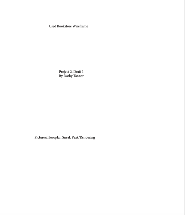
The second project tasked students with extensive usability and accessibility design peer reviews. IN order to engage in these peer review sessions, students were allowed to choose any used space to redesign. I chose to develop my own design for a used bookstore based on my anecdotal experiences working in and shopping at bookstores. The project is split up into three peer reviewed drafts and one final draft.
For Draft 1, I constructed a rough wireframe of what I imagined my final product for a used bookstore design layout would look like. This included two hand-drawn depictions of the store of the store front and floor plan as well as general labels for what content each page of the final document would include. I was not happy with the color palette or font choice for this draft, neither of which I kept for the final project. However, I loved the visual elements of my illustrated pieces and the circular elements because I knew they could bring my brainstorming process to life.
Many things changed from Draft 1 to Draft 2, including the color palette, the fonts, the layout, blocking out space for content, and headings for each section. One of the main things I asked for advice on was my color palette. My peers enjoyed this combination of colors, but I couldn’t help feeling bored by them. I decided to personalize the document come Draft 3 with a bright, fun color palette that captures attention without looking unprofessional. At least, that was my goal.
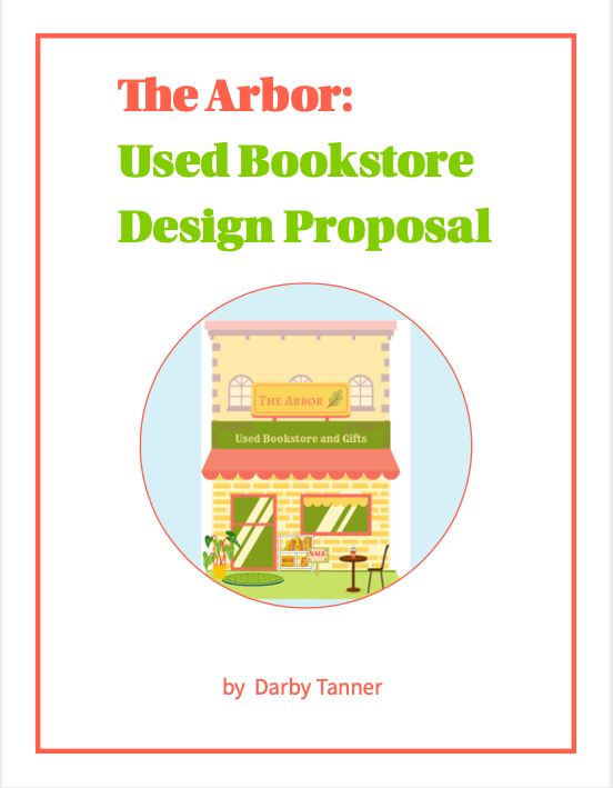
Draft 3 is the most visually changed draft of my portfolio for two main reasons: (1) I completely changed the color palette from drab purples to a bright, dimensional combination of yellows, oranges, and pinks. These colors were inspired by my time working in Canva to develop the “Color Palette” mood board and the “Storefront Rendering.” I created each piece by uploading, typing, and layering graphics on top of each other and adjusting the color palette accordingly so that each visual element looked like they belonged together. The only incomplete aspect of this draft was the floor plan, which I only had time to construct a very simple version of in Canva using the shape tools.
On top of any minor tweaks to layout, color, and font, my Final Draft of this redesign proposal includes a full-color rendering of the store front and the floor plan. At the advice of my peers, I included a key on the floor plan map so that all graphics were readable and understandable. If I were to go back and adjust anything else about this draft, it would be the font for the “Floor Plan Rendering” because while the font matches the heading, it does not match the font of the rest of the document’s body text.

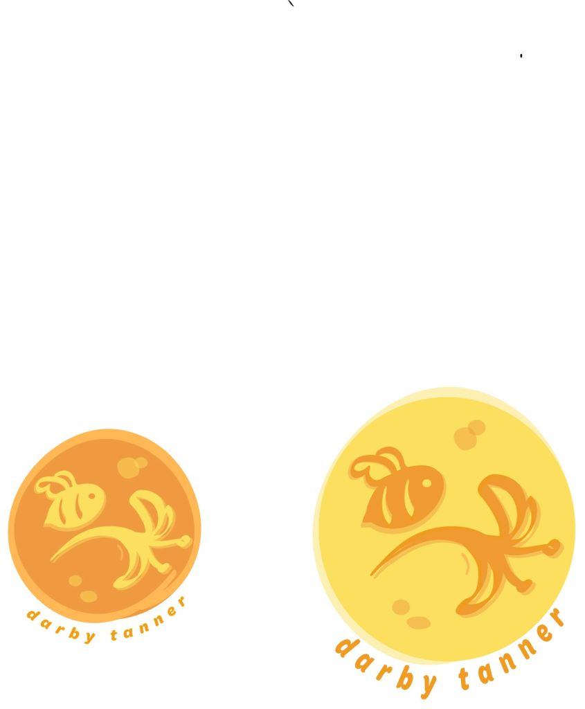
I decided to create my own branding materials in three forms: 1. a logo, 2. a business card, and 3. social media headers. The logo is hand drawn by me using Adobe Illustrator and the other materials were design in Adobe InDesign. I decided on a bee and honeysuckle design because I have a tattoo of this image on my left shoulder blade. The bee represents tenacity while the honeysuckle represents childlike imagination, which are both qualities that coexist within me.


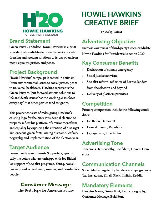
I was assigned with the task of working with the Green Party’s 2020 logo, analyzing its rhetorical situation, developing a creative brief, and ultimately redesigning it. I chose the Green Party’s logo for two reasons: 1. while the original logo isn’t terrible, it has obvious design issues and 2. I was able to learn about the platform of a lesser-known political party, providing a unique rhetorical challenge. I was able to create a logo that better reflects Hawkin’s platform of environmentalism, socialism, and peace by choosing a less-angular font, sampling the Green Party’s color palette, incorporating leaf iconography, and blurbing the logo with a quote inspired by the information on environmentalism provided by the Green Party’s official website.