In fulfillment of WRTG 4309 Introduction to Publishing, here is a timeline of the drafts I created while developing both Project 1: Skills Development Proposal & Publishing Plan, Project 2: Publishing Plan Review Slideshow, and Project 3: Published Deliverable. These projects were assigned to test my knowledge of the publishing process and skills associated with design software including Adobe InDesign.
Project 1
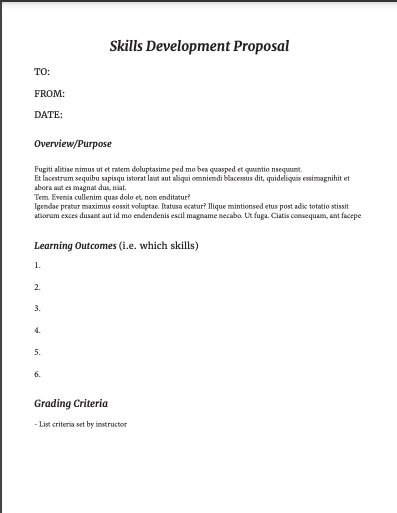
The first project for WRTG 4309 tasked students with developing a proposal for my own skills development this semester as well as a publishing plan for the Project 3 deliverable. The project is split up into two parts — the proposal and the publishing plan – but are combined into one document. The skills development proposal is specifically concerned with my personal agenda for developing practical skills with any given design software, my choice being Adobe InDesign. The publishing plan asked students to think ahead to the end of semester in regard to the document we wanted to theoretically publish with physical materials.
Draft 1
In my first draft, I focused on three main aspects: font, organization, and layout. I was satisfied with the colors I chose because I wanted the document to appear like a professional document, and I also enjoyed my font choice. However, I was worried that the organization of the piece was confusing or was missing necessary sections. At this point, I was unsure how to incorporate visual imagery.
Draft 2
As you can see, my second draft includes a much more detailed mock-up of what I wanted the Skills Development Proposal and the Publishing Plan to look like. I also filled in much of the content and explanation. However, my timeline was not accurate to the weeks I would be working on Project 3 and I still had fears that my project was too cramped.
Final draft
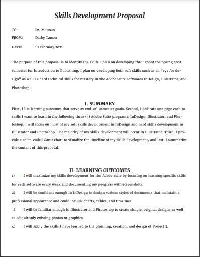
The final draft of Project 1 led to huge changes and additions, including adjusting the layout to fit IEEE Guidelines and add in all of the detailed information regarding the specific skills I wanted to develop as well as the publishing specifications. I wasn’t completely satisfied with the colors I chose or the layout of the “Estimated Costs” table, but I was happy with my work overall.

Project 2
Project 2 is basically an extension of Project 1 but was heavily focused on peer review and collaboration specifically regarding the Publishing Plans. I won’t go into detail regarding what my team discussed because we summarize our feedback in a PowerPoint presentation, which is included as a file to view at the end of this section. The point of this project was to engage in usability and design critiques with a dedicated group of peers so that there was an opportunity for routine and substantive feedback.
Draft 1 & 2
Final Draft
Project 3
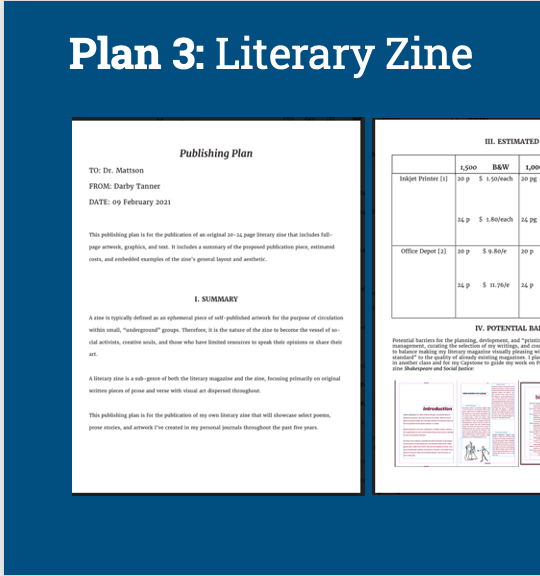
Project 3 is the culmination of the work put into Projects 1 and 2 regarding the Publishing Plan. Each student was tasked with applying our publishing, design, and personal knowledge to developing a published deliverable. Each deliverable had to be on a subject of value to a subject matter expert (SME) and must comprise 20 OR 24 pages of content (including front and back cover) in order to This number of pages will give us opportunity to practice 4 principles of design and the skills we taught ourselves in our chosen software throughout the semester. I used Adobe InDesign to develop a literary magazine comprised of my original art and poetry, which I put through extensive edits to be included in this piece.
Draft 1
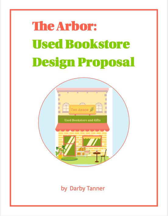
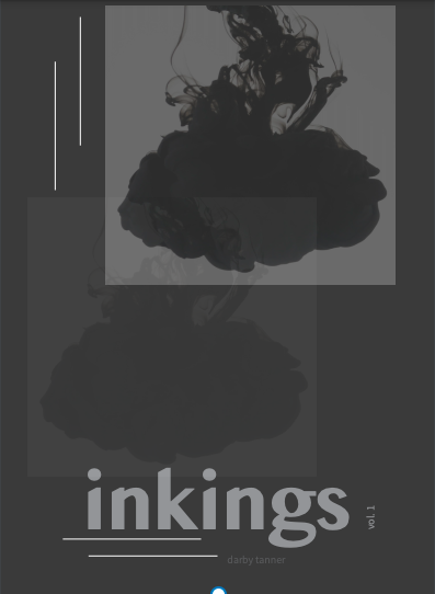
Draft 1 is the only draft that was peer reviewed for this project cycle. As you can see when you see my final draft, I was very conflicted about the color palette of my project. I originally wanted the magazine to be titled “inkings” after my first Wattpad poetry collection called “ink,” but I feared that my cover design — while fitting the genre conventions — was too dark and bland. My peer reviewers primarily agreed, so I completely switched up my title and color palette to warm neutrals and renamed it “Nightshade” after one of the poems included in the collection.
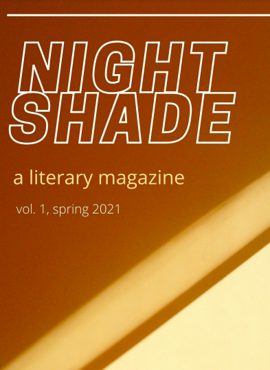
Final Draft
If I were to actually print this collection, I would spend more time adding in photos of my original art, experimenting with font, and adjusting the font sizes. At this moment, I prefer the color palette of my final draft but I think the “inkings” cover design was more engaging and genre-appropriate than my Canva-made “Nightshade” cover. I will probably try to combine my ideas for each draft into a final deliverable if I ever want to physically circulate “Nightshade.”