M.A. Professional & Technical Writing – University of Arkansas at Little Rock

M.A. Professional & Technical Writing – University of Arkansas at Little Rock

In fulfillment of WRTG 4309 Introduction to Publishing, here is a timeline of the drafts I created while developing both Project 1: Skills Development Proposal & Publishing Plan, Project 2: Publishing Plan Review Slideshow, and Project 3: Published Deliverable. These projects were assigned to test my knowledge of the publishing process and skills associated with design software including Adobe InDesign.
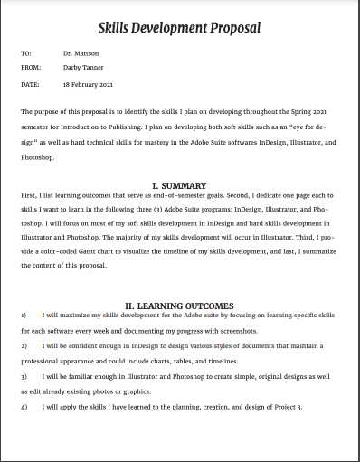
The first project for WRTG 4309 tasked students with developing a proposal for my own skills development this semester as well as a publishing plan for the Project 3 deliverable. The project is split up into two parts — the proposal and the publishing plan – but are combined into one document. The skills development proposal is specifically concerned with my personal agenda for developing practical skills with any given design software, my choice being Adobe InDesign. The publishing plan asked students to think ahead to the end of semester in regard to the document we wanted to theoretically publish with physical materials.
In my first draft, I focused on three main aspects: font, organization, and layout. I was satisfied with the colors I chose because I wanted the document to appear like a professional document, and I also enjoyed my font choice. However, I was worried that the organization of the piece was confusing or was missing necessary sections. At this point, I was unsure how to incorporate visual imagery.
As you can see, my second draft includes a much more detailed mock-up of what I wanted the Skills Development Proposal and the Publishing Plan to look like. I also filled in much of the content and explanation. However, my timeline was not accurate to the weeks I would be working on Project 3 and I still had fears that my project was too cramped.
The final draft of Project 1 led to huge changes and additions, including adjusting the layout to fit IEEE Guidelines and add in all of the detailed information regarding the specific skills I wanted to develop as well as the publishing specifications. I wasn’t completely satisfied with the colors I chose or the layout of the “Estimated Costs” table, but I was happy with my work overall.

Project 2 is basically an extension of Project 1 but was heavily focused on peer review and collaboration specifically regarding the Publishing Plans. I won’t go into detail regarding what my team discussed because we summarize our feedback in a PowerPoint presentation, which is included as a file to view at the end of this section. The point of this project was to engage in usability and design critiques with a dedicated group of peers so that there was an opportunity for routine and substantive feedback.
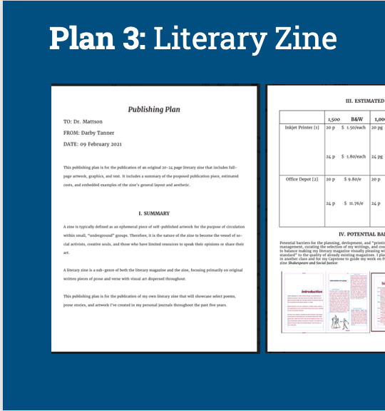
Project 3 is the culmination of the work put into Projects 1 and 2 regarding the Publishing Plan. Each student was tasked with applying our publishing, design, and personal knowledge to developing a published deliverable. Each deliverable had to be on a subject of value to a subject matter expert (SME) and must comprise 20 OR 24 pages of content (including front and back cover) in order to This number of pages will give us opportunity to practice 4 principles of design and the skills we taught ourselves in our chosen software throughout the semester. I used Adobe InDesign to develop a literary magazine comprised of my original art and poetry, which I put through extensive edits to be included in this piece.
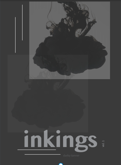
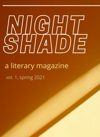
Draft 1 is the only draft that was peer reviewed for this project cycle. As you can see when you see my final draft, I was very conflicted about the color palette of my project. I originally wanted the magazine to be titled “inkings” after my first Wattpad poetry collection called “ink,” but I feared that my cover design — while fitting the genre conventions — was too dark and bland. My peer reviewers primarily agreed, so I completely switched up my title and color palette to warm neutrals and renamed it “Nightshade” after one of the poems included in the collection.
If I were to actually print this collection, I would spend more time adding in photos of my original art, experimenting with font, and adjusting the font sizes. At this moment, I prefer the color palette of my final draft but I think the “inkings” cover design was more engaging and genre-appropriate than my Canva-made “Nightshade” cover. I will probably try to combine my ideas for each draft into a final deliverable if I ever want to physically circulate “Nightshade.”

In fulfillment of WRTG 3306 Information Design II, here is a timeline of the drafts I created while developing both Project 1: Usability/Accessibility Help Guides and Project 2: Usability/Accessibility Testing Your Design. These projects were assigned to test my knowledge of the user experience (UX) and my design skills in terms of usability and accessibility.
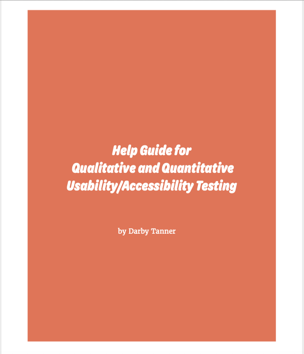
The first project for WRTG 3306 tasked students with developing “Help Guides” for potential clients who need help developing their own guidelines and “best practices” for UX testing. The project is split up into two parts — a quantitative testing help guide and a qualitative testing help guide– that consist of two peer-reviewed drafts and one final draft.
In my first draft, I focused on three main aspects: font, color palette, and layout. I was satisfied with the colors I chose, but I had concerns regarding my font choice. I worried that the “bubble” letters used on the title page and subsequent headings weren’t readable. However, I was confident that my organizational layout was logical and easy to follow. My peer review session helped me choose how to design my title page so that the fonts flowed together without blending.
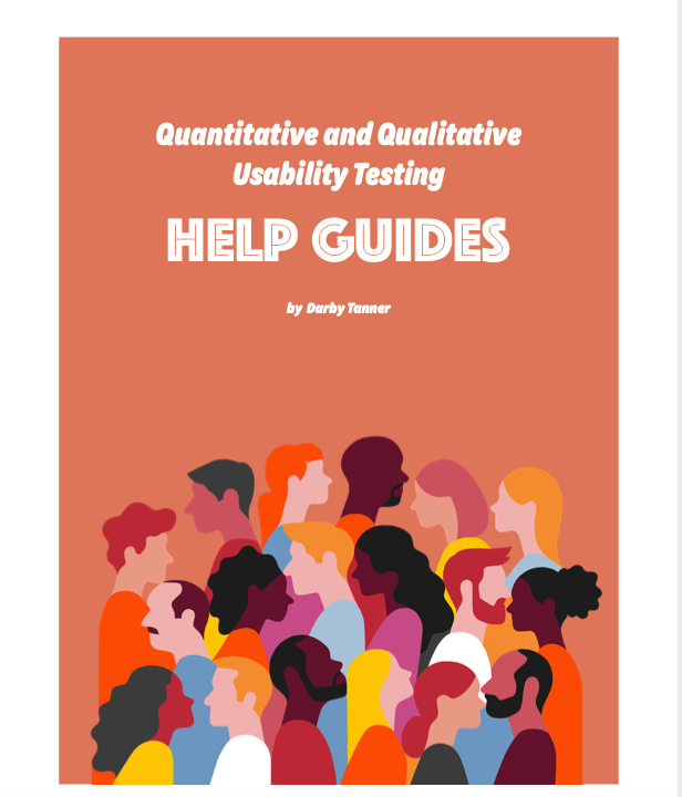
I made significant progress regarding content and visuals by the time I submitted Draft 2 for peer review. I struggled putting myself in the shoes of a UX expert who was making this document for a client, so I only had half the questions for each section filled out. Discussion with peers helped me to better understand what questions I should be including in each section. I also decided that the vector graphics I included were suitable for the project, but I knew the blue graphic on the “Contents” page did not fit the color scheme.
In addition to filling out the rest of the content, my Final Draft endured extensive layout changes. With the advice of my peers in tow and guidance from their own designs, I decided that my previous layout was too cramped; therefore, I separated each section by pages rather than relying on headings to do all the work for me. This allowed for the project to have a more professional and readable aesthetic. Lastly, I changed the font for the content pages. This change was a result of a flaw in my design that I labeled as “imbalance.” Where I first thought a serif font would balance out the bubble font, I quickly realized that the fonts did not blend well together. So I chose a crisp, thin sans serif font and used the “bold” feature to highlight key terms.
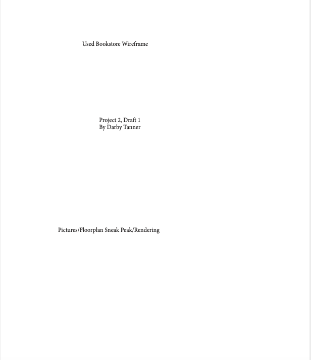
The second project tasked students with extensive usability and accessibility design peer reviews. IN order to engage in these peer review sessions, students were allowed to choose any used space to redesign. I chose to develop my own design for a used bookstore based on my anecdotal experiences working in and shopping at bookstores. The project is split up into three peer reviewed drafts and one final draft.
For Draft 1, I constructed a rough wireframe of what I imagined my final product for a used bookstore design layout would look like. This included two hand-drawn depictions of the store of the store front and floor plan as well as general labels for what content each page of the final document would include. I was not happy with the color palette or font choice for this draft, neither of which I kept for the final project. However, I loved the visual elements of my illustrated pieces and the circular elements because I knew they could bring my brainstorming process to life.
Many things changed from Draft 1 to Draft 2, including the color palette, the fonts, the layout, blocking out space for content, and headings for each section. One of the main things I asked for advice on was my color palette. My peers enjoyed this combination of colors, but I couldn’t help feeling bored by them. I decided to personalize the document come Draft 3 with a bright, fun color palette that captures attention without looking unprofessional. At least, that was my goal.
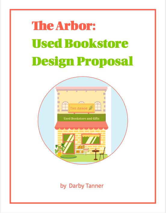
Draft 3 is the most visually changed draft of my portfolio for two main reasons: (1) I completely changed the color palette from drab purples to a bright, dimensional combination of yellows, oranges, and pinks. These colors were inspired by my time working in Canva to develop the “Color Palette” mood board and the “Storefront Rendering.” I created each piece by uploading, typing, and layering graphics on top of each other and adjusting the color palette accordingly so that each visual element looked like they belonged together. The only incomplete aspect of this draft was the floor plan, which I only had time to construct a very simple version of in Canva using the shape tools.
On top of any minor tweaks to layout, color, and font, my Final Draft of this redesign proposal includes a full-color rendering of the store front and the floor plan. At the advice of my peers, I included a key on the floor plan map so that all graphics were readable and understandable. If I were to go back and adjust anything else about this draft, it would be the font for the “Floor Plan Rendering” because while the font matches the heading, it does not match the font of the rest of the document’s body text.

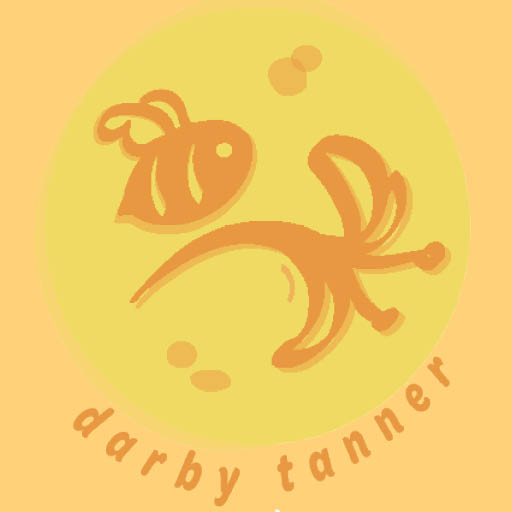
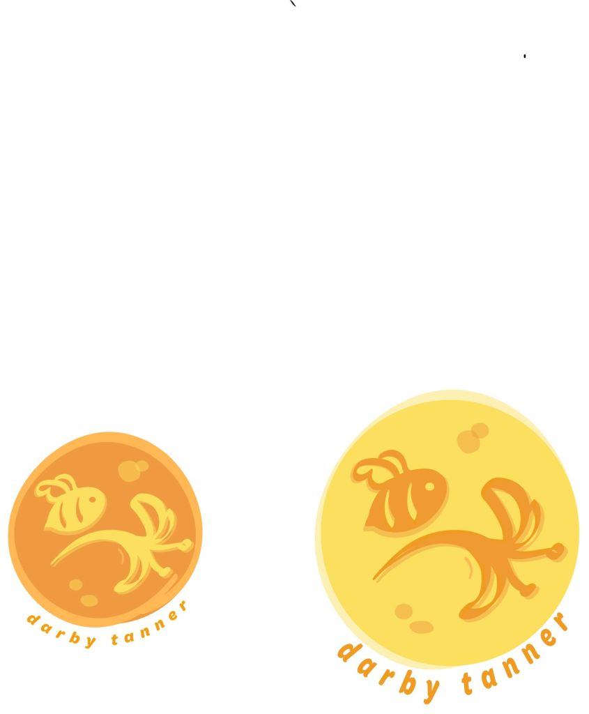
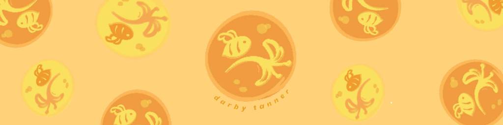
I decided to create my own branding materials in three forms: 1. a logo, 2. a business card, and 3. social media headers. The logo is hand drawn by me using Adobe Illustrator and the other materials were design in Adobe InDesign. I decided on a bee and honeysuckle design because I have a tattoo of this image on my left shoulder blade. The bee represents tenacity while the honeysuckle represents childlike imagination, which are both qualities that coexist within me.
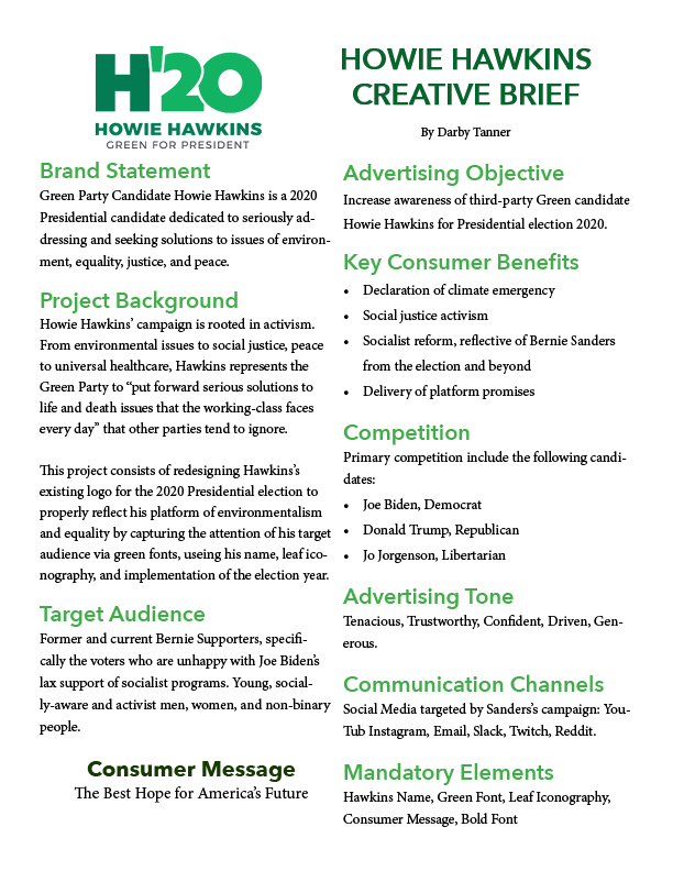
I was assigned with the task of working with the Green Party’s 2020 logo, analyzing its rhetorical situation, developing a creative brief, and ultimately redesigning it. I chose the Green Party’s logo for two reasons: 1. while the original logo isn’t terrible, it has obvious design issues and 2. I was able to learn about the platform of a lesser-known political party, providing a unique rhetorical challenge. I was able to create a logo that better reflects Hawkin’s platform of environmentalism, socialism, and peace by choosing a less-angular font, sampling the Green Party’s color palette, incorporating leaf iconography, and blurbing the logo with a quote inspired by the information on environmentalism provided by the Green Party’s official website.


For my student led project, I plan on creating my own set of personal branding materials for future creative freelance projects. The materials will include a logo, business card, and social media headers, including for my website.
I chose a logo from a freelance artist that I follow closely on Instagram. She has a very specific, eclectic persona that helps market her artistic pursuits, including cosplay, wool felting, and illustration. She sells these products on her Instagram @shandelions and her website https://shandelions.bigcartel.com/.
What I admire about her branding is her utilization of three design principles: the Gestalt principle, balance, and colors of a similar tone. The Gestalt principle has to do with association due to proximity. If you go to her website, she sells a lot of merchandise focused on nature, with motifs of pumpkins, mushrooms, plants, and insects. The name that she goes by, Shan, is also on display within her username for her social media platforms Shandelions. The proximity of her most used motifs and her name incorporated into the word “dandelions” immediately creates a connection within the minds of users that Shan is a creator who loves nature, which her products reflect.
The balance of her hand-drawn elements is evident with the two similarly sized mushrooms closing in her name Shandelions, drawing the eye to her brand name. The other elements, including the butterflies, ladybug, and pumpkin, are small yet evident enough to allow her to display her earthy, eclectic personality without drawing the eye away from the primary content. Incorporating the ladybug and pumpkin into her name was a great way for the design to remain balanced yet true to her personality.
Lastly, her choice of colors also speak to her earthy persona and are appropriate to the colors she incorporates into most of her art. Not only do the colors display what she care’s about in her art, but the color scheme is not distracting because only a few colors are actually used just in varying values.
Overall, I want my branding materials to capture my own eclecticism and artistic personality to the success that I view Shan’s, using proximity, balance, and colors to her marketing advantage.

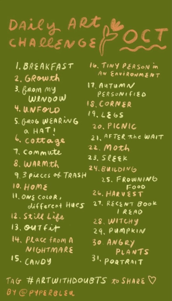
Pyperbleu (screen name for artist Annabelle on Instagram) created this design to showcase her daily plan for Inktober, a popular daily art challenge in October. Inktober usually refers to only ink drawing, but Pyperbleu decided to focus more on guache painting than ink drawings; thus, she titled this piece Daily Art Challenge: OCT instead of Inktober Prompts .
This design is appealing to me because of the natural color palette, handwritten font style, and simple drawings. Also, the format appeals to me because I love using Instagram for updates on my favorite artists. She used this picture for an Instagram story, which is evident because of the text’s size and organization.
The color palette, font, and doodles are appealing to me as an aspiring artist and writer because of the sketchy, creative aesthetic. Her art style always catches my attention because all of her informational posts are designed this way and reflects her branding as a freelance artist.
The three design principles I will be discussing in review of the 2020 Green Party Presidential candidate’s (Howie Hawkins) logo are as follows: color, font, and content.
First, the colors are muted versions of green that are pleasing to the eye, sparingly used, and appropriate for identifying the Green Party. Since only two shades of green are used, the logo is appealing rather than confusing, and interesting rather to monotonous. It would be very difficult for anyone to misconstrue the logo as for any other political party.
Second, the two fonts used are similar enough to remain streamlined while establishing a hierarchy of importance. For instance, the actual logo is the largest size while the descriptions decrease in size and boldness as the eye travels downward.
Third, the bolded “H” is of eerie resemblance to Hillary Clinton’s 2016 Democratic campaign logo that was widely mocked for its lack of substance. In contrast to Clinton’s logo, the “H” is more appropriate in this context because the letter stands for both of Hawkins’s initials; also, the addition of a bold “’20” adds more character to the design. As a stand-alone logo, the design appears as more of an advertisement for water than a presidential candidate, unfortunately. It kind of makes sense due to his strong stance on environmental issues but can be comedically distracting. The “Black Power” fist within the zero also identifies Hawkins’s respect for social justice issues.
