B.A. English Literature – University of Central Arkansas – Schedler Honors College
Capstone/Thesis

B.A. English Literature – University of Central Arkansas – Schedler Honors College

M.A. Professional & Technical Writing – University of Arkansas at Little Rock

M.A. Professional & Technical Writing – University of Arkansas at Little Rock

In fulfillment of WRTG 3306 Information Design II, here is a timeline of the drafts I created while developing both Project 1: Usability/Accessibility Help Guides and Project 2: Usability/Accessibility Testing Your Design. These projects were assigned to test my knowledge of the user experience (UX) and my design skills in terms of usability and accessibility.
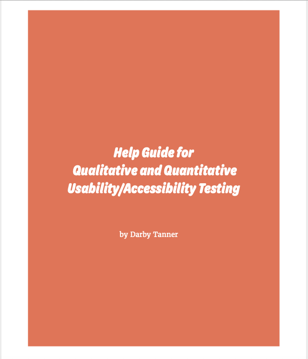
The first project for WRTG 3306 tasked students with developing “Help Guides” for potential clients who need help developing their own guidelines and “best practices” for UX testing. The project is split up into two parts — a quantitative testing help guide and a qualitative testing help guide– that consist of two peer-reviewed drafts and one final draft.
In my first draft, I focused on three main aspects: font, color palette, and layout. I was satisfied with the colors I chose, but I had concerns regarding my font choice. I worried that the “bubble” letters used on the title page and subsequent headings weren’t readable. However, I was confident that my organizational layout was logical and easy to follow. My peer review session helped me choose how to design my title page so that the fonts flowed together without blending.
I made significant progress regarding content and visuals by the time I submitted Draft 2 for peer review. I struggled putting myself in the shoes of a UX expert who was making this document for a client, so I only had half the questions for each section filled out. Discussion with peers helped me to better understand what questions I should be including in each section. I also decided that the vector graphics I included were suitable for the project, but I knew the blue graphic on the “Contents” page did not fit the color scheme.
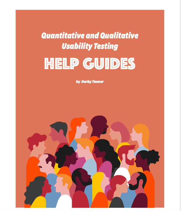
In addition to filling out the rest of the content, my Final Draft endured extensive layout changes. With the advice of my peers in tow and guidance from their own designs, I decided that my previous layout was too cramped; therefore, I separated each section by pages rather than relying on headings to do all the work for me. This allowed for the project to have a more professional and readable aesthetic. Lastly, I changed the font for the content pages. This change was a result of a flaw in my design that I labeled as “imbalance.” Where I first thought a serif font would balance out the bubble font, I quickly realized that the fonts did not blend well together. So I chose a crisp, thin sans serif font and used the “bold” feature to highlight key terms.
The second project tasked students with extensive usability and accessibility design peer reviews. IN order to engage in these peer review sessions, students were allowed to choose any used space to redesign. I chose to develop my own design for a used bookstore based on my anecdotal experiences working in and shopping at bookstores. The project is split up into three peer reviewed drafts and one final draft.
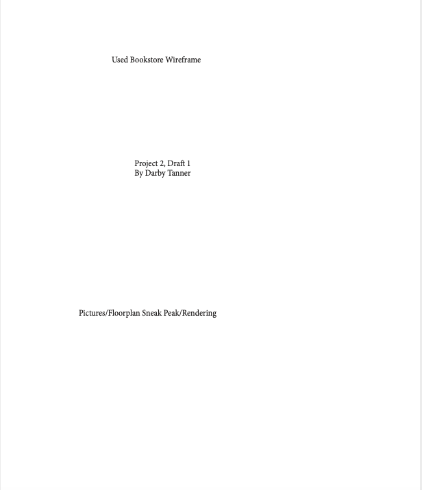
For Draft 1, I constructed a rough wireframe of what I imagined my final product for a used bookstore design layout would look like. This included two hand-drawn depictions of the store of the store front and floor plan as well as general labels for what content each page of the final document would include. I was not happy with the color palette or font choice for this draft, neither of which I kept for the final project. However, I loved the visual elements of my illustrated pieces and the circular elements because I knew they could bring my brainstorming process to life.
Many things changed from Draft 1 to Draft 2, including the color palette, the fonts, the layout, blocking out space for content, and headings for each section. One of the main things I asked for advice on was my color palette. My peers enjoyed this combination of colors, but I couldn’t help feeling bored by them. I decided to personalize the document come Draft 3 with a bright, fun color palette that captures attention without looking unprofessional. At least, that was my goal.
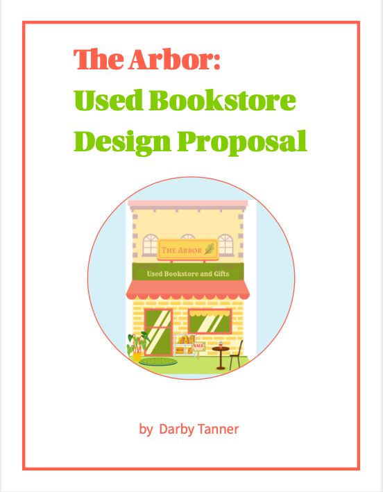
Draft 3 is the most visually changed draft of my portfolio for two main reasons: (1) I completely changed the color palette from drab purples to a bright, dimensional combination of yellows, oranges, and pinks. These colors were inspired by my time working in Canva to develop the “Color Palette” mood board and the “Storefront Rendering.” I created each piece by uploading, typing, and layering graphics on top of each other and adjusting the color palette accordingly so that each visual element looked like they belonged together. The only incomplete aspect of this draft was the floor plan, which I only had time to construct a very simple version of in Canva using the shape tools.
On top of any minor tweaks to layout, color, and font, my Final Draft of this redesign proposal includes a full-color rendering of the store front and the floor plan. At the advice of my peers, I included a key on the floor plan map so that all graphics were readable and understandable. If I were to go back and adjust anything else about this draft, it would be the font for the “Floor Plan Rendering” because while the font matches the heading, it does not match the font of the rest of the document’s body text.

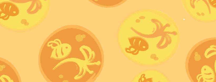
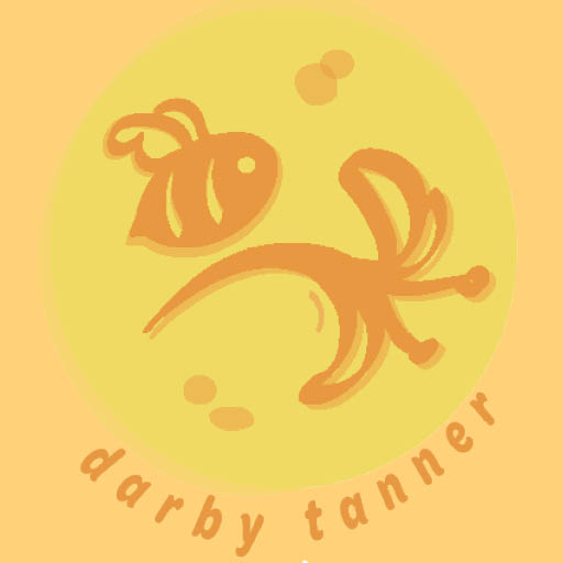
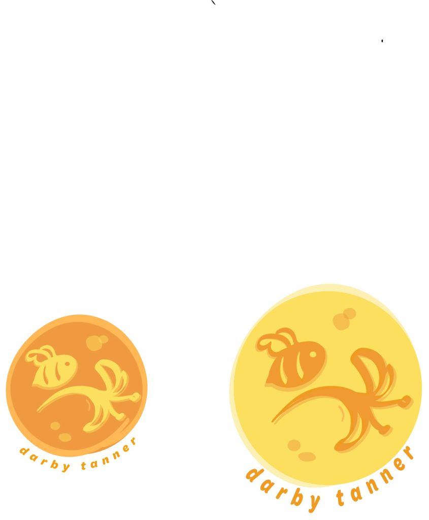
I decided to create my own branding materials in three forms: 1. a logo, 2. a business card, and 3. social media headers. The logo is hand drawn by me using Adobe Illustrator and the other materials were design in Adobe InDesign. I decided on a bee and honeysuckle design because I have a tattoo of this image on my left shoulder blade. The bee represents tenacity while the honeysuckle represents childlike imagination, which are both qualities that coexist within me.